Waitrose Rapid Delivery
Client
Waitrose & Partners, John Lewis Partnership
Tasks
Background
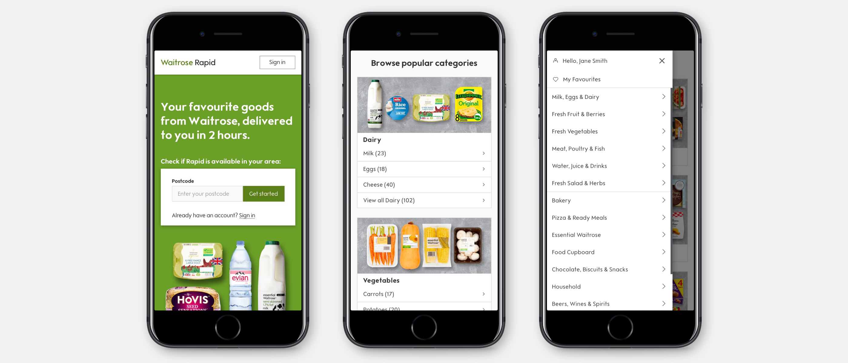
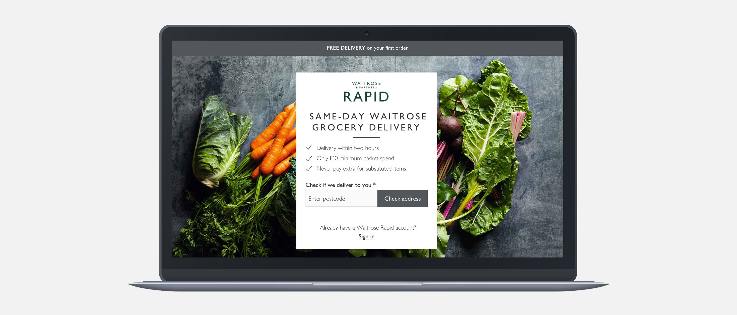
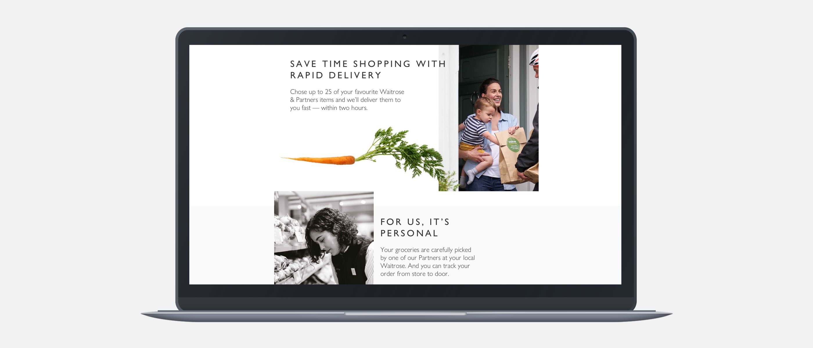
Waitrose Rapid is a quick-delivery service; launched to offer customers a same-day delivery on their grocery shopping.
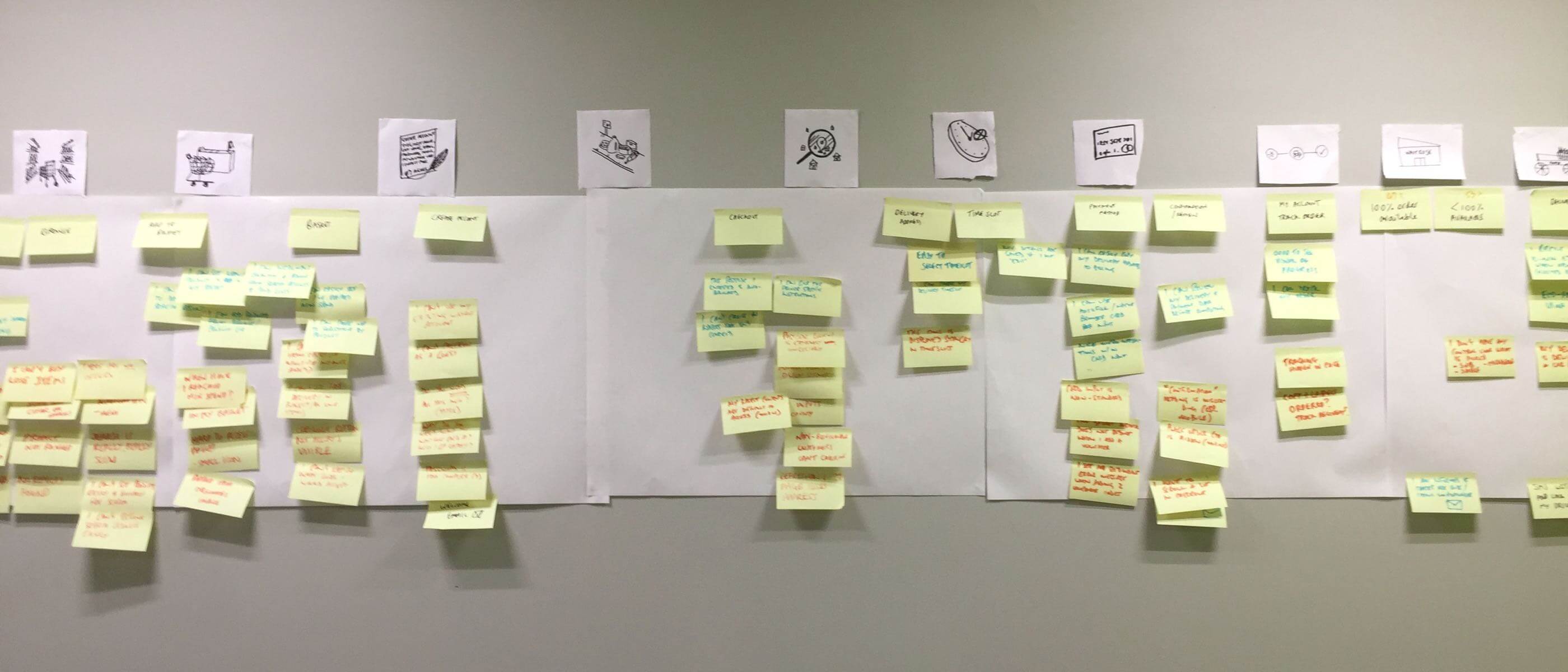
Existing data, analytics and empathy-mapping
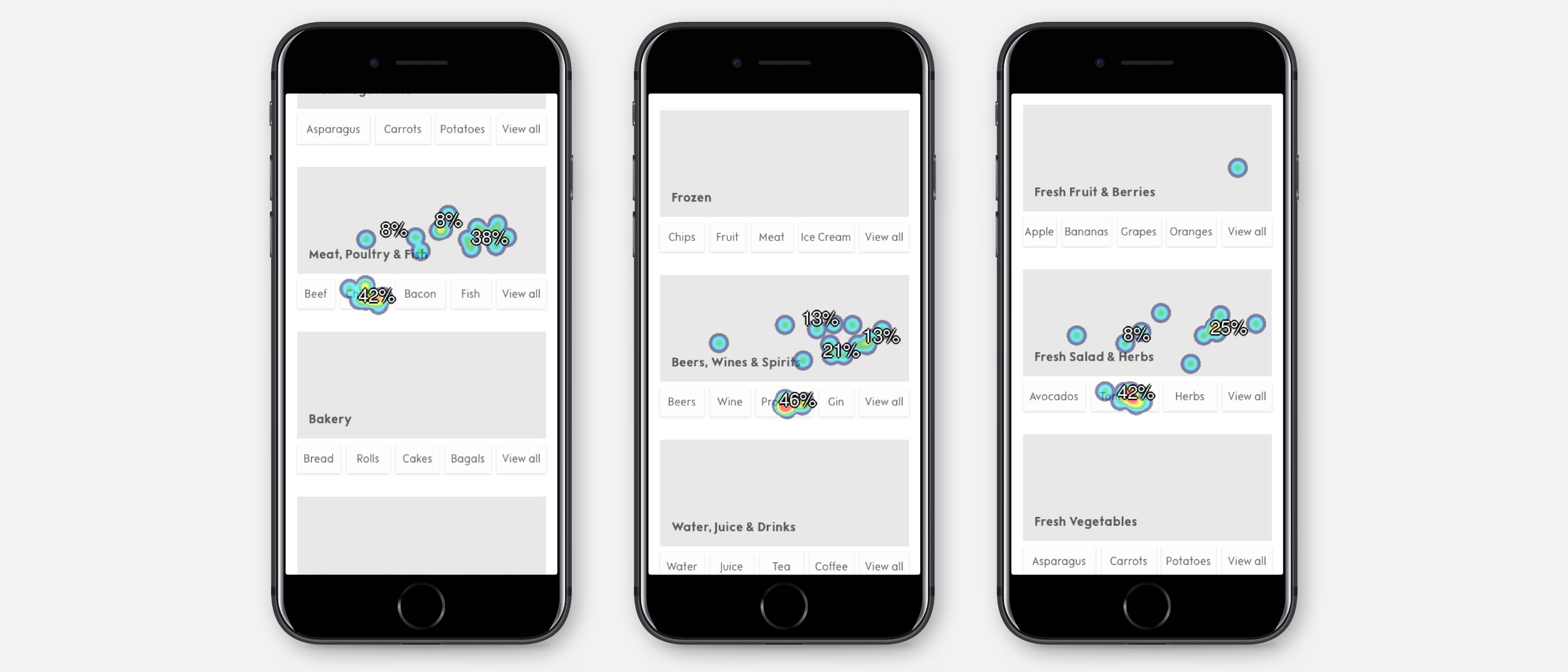
Together with on-site analytical data and feedback surveys, we carried out an empathy-mapping workshop for the end-to-end experience. Below each step of the journey we mapped pains, gains and communications.
4.5
Poor customer struggle score
Homepage browse, August 2019

76%
Weak conversion on Delivery Address
Checkout delivery, August 2019

Problems with the previous interface, identified from analytics, heuristic evaluation and against Baynard Institute benchmarks were:
- Categories were broad, vague and users could not easily infer the scope of products easily in each cateogry
- Secondary hierachy (intermediary category) pages are hidden and not directly accessible from the homepage. On mobile, categories could not be navigated to via menu.
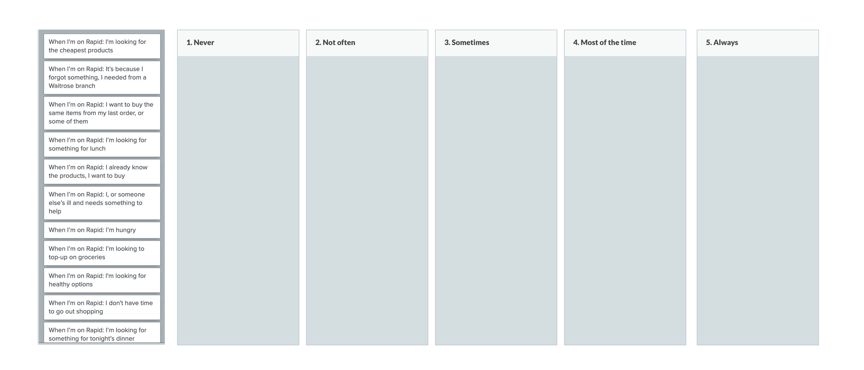
User Research
To understand better user-needs I organised a card-sorting research activity with existing customers. Particpants were asked to rank scenarios in order of frequency, from never - always. A questionnaire also gave users an opportunity describe scenarios we may not have accounted for.
Identifying user and business goals
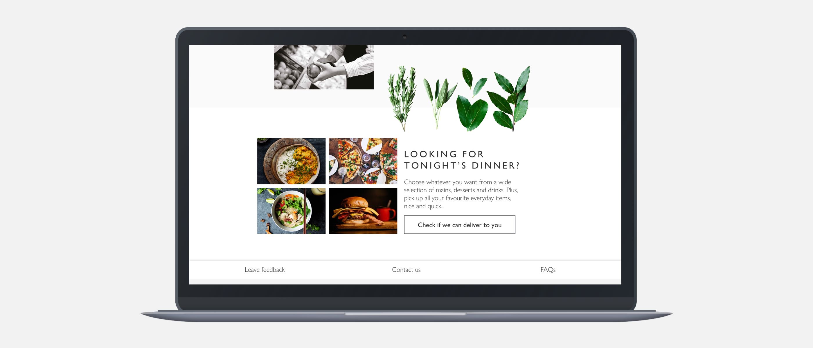
The primary goal of Rapid was to provide a quick delivery service for groceries. It was essential the interface would:
- Allow users to quickly navigate to products for a rapid shopping experience
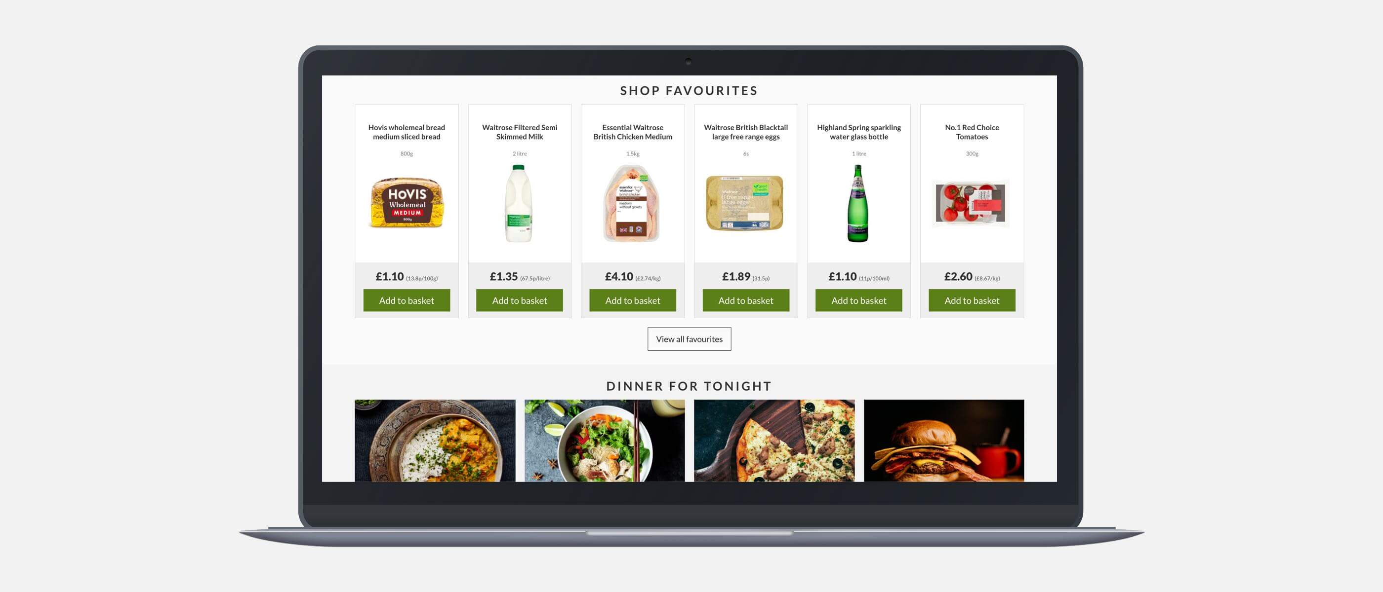
- Allow users to easy view popular & favourite products
- Communicate clearly the scope of categories
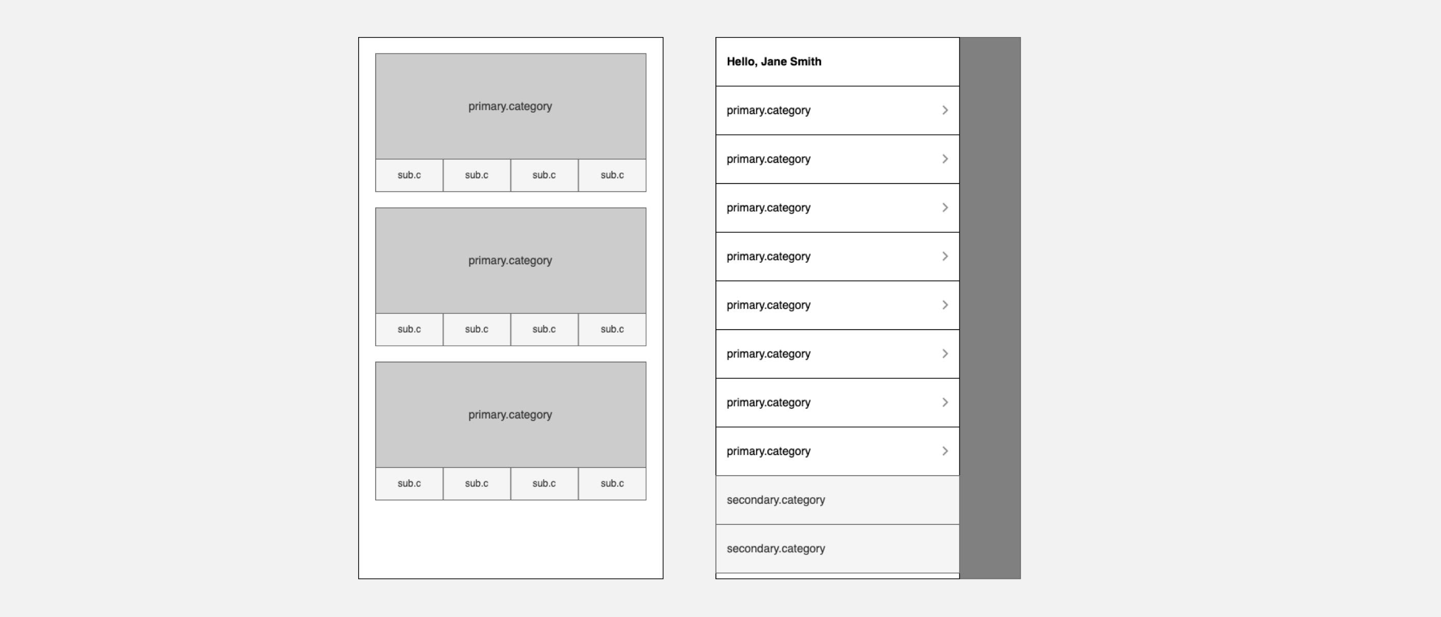
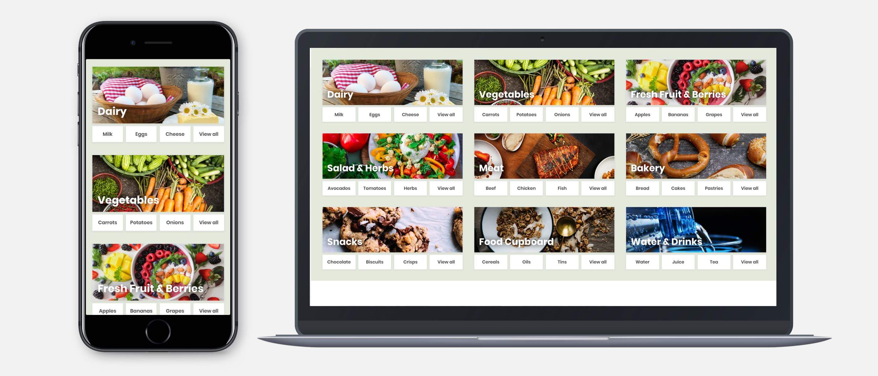
Low fidelity wireframing
70% of mobile users, when landing directly on the homepage, will try to infer the type of site and the breadth of products carried by performing a “Scroll & Scan” of the homepage contents.
The hypothesis was shortcuts beneath each category would give stronger indication of category breadth and quick navigation to popular product-list-pages.
To test our assumptions on how the category shortcuts would perform, I organised a remote click-map task with 27 participants. Participants were tasked with finding a particular product by browsing. The results gave a healthy indication shortcuts were being not only being used, but guiding users to click primary categories. This validated our assumptions on user behaviour for the design.
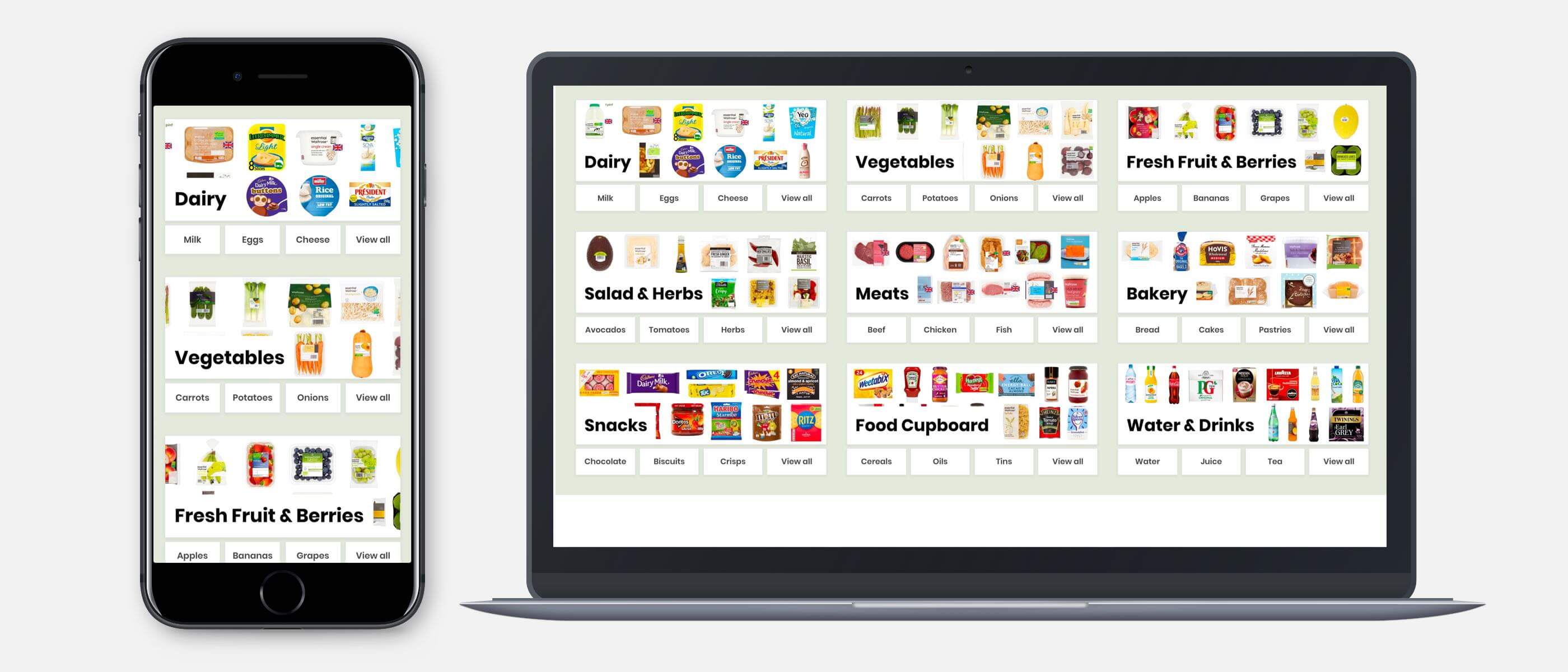
Coded prototypes
A coded prototype was created to test how the design would responsively scale and pressure-tested the shortcuts.
To give more allowance for longer shortcut labels and prevent text-overflow issues, block shortcuts instead of inline were implemented.
Lifestyle imagery did not communicate the scope of category effectively. To help navigation and communicating scope, product-led imagery was chosen as being more relevant. When testing both prototypes, the product-led approach out-performed the lifestyle images for helpfulness to navigate. However, the lifestyle images were cognitively easier. The decision was made to use a combination of both approaches.
Outcome and performance
One month after pushing the new designs live, we repeated analytics and heat mapping. The results were positive and booking conversions had improved significantly on mobile. Through-traffic had improved from the homepage to the experience and gift page.
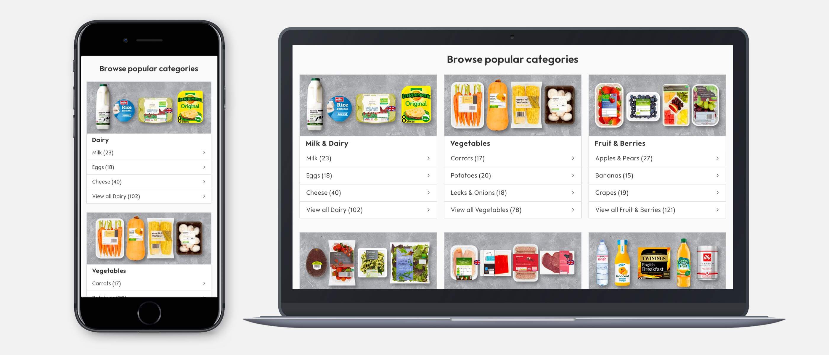
+18%
Increase in through-traffic to List Pages
Popular Categories, Oct 2019

+10%
Increased checkout delivery step
Checkout Delivery, Oct 2019

Interactive Prototype
An interactive prototype demonstrated the expandable navigation menu.
Follow me