Waitrose Wine Tasting at Home
Client
Waitrose & Partners, John Lewis Partnership
Tasks
Background
Waitrose Wine Tasting At Home is a new experience service launched by Waitrose. Compared to a traditional wine tasting, this is a very personal experience in which a specialist brings the wine tasting to your home.
Existing data, analytics and problem
Before redesigning, we improved analytics on how the existing website was performing by implementing tracking tags on enquiry buttons as events. From one month, we discovered behavioural data when combined with user feedback, highlighted problematic areas. In particular, the conversion between users attempting to submit an enquiry form to success.
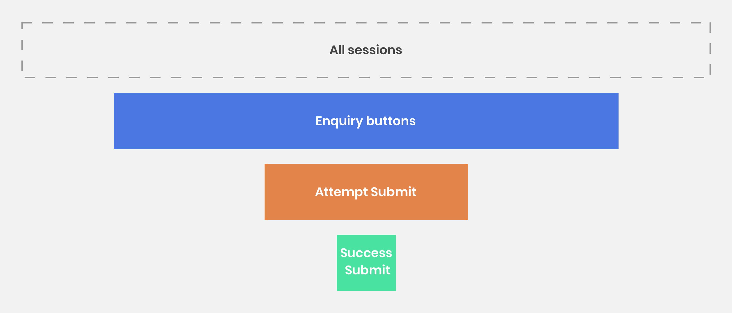
44%
Weak conversion on mobile devices
Success Submit, Februrary 2019

47%
Weak conversion from Returning Users
Success Submit, Februrary 2019

The previous website was not responsively optimised for mobile devices. Form components did not follow usability standards and accepted design patterns. From analytics, we saw over 76% of users were on mobile devices. The difficulties by users were also expressed in survey feedback:
"I would like to make an enquiry, but the mobile form is very tricky. There was little indication the enquiry had been submitted to you."
- Customer feedback
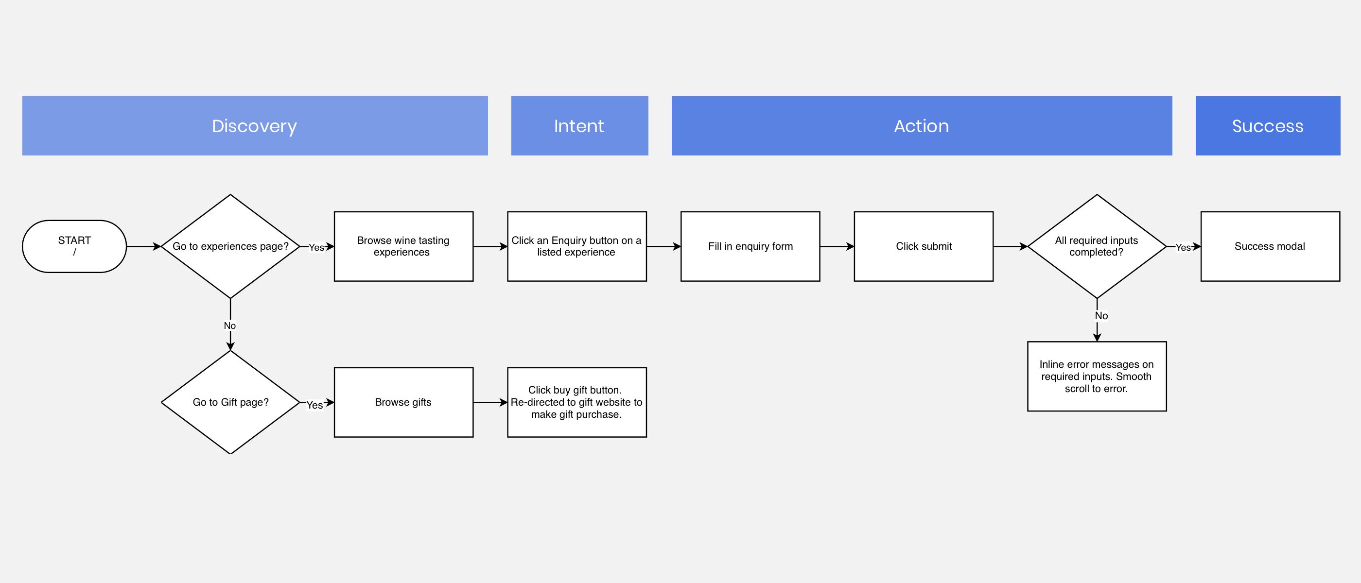
Identifying user and business goals
The primary function of the online application was for users to select the tasting experience they were interested in, fill-in and submit a booking form. Together with the Product Owner team, we identified two main goals:
- Improve the form usability and mobile experience to increase the booking enquiry conversion, given most users are on mobile
- Improve the through-traffic to the gift and experience page, from the homepage, to encourage gift purchases
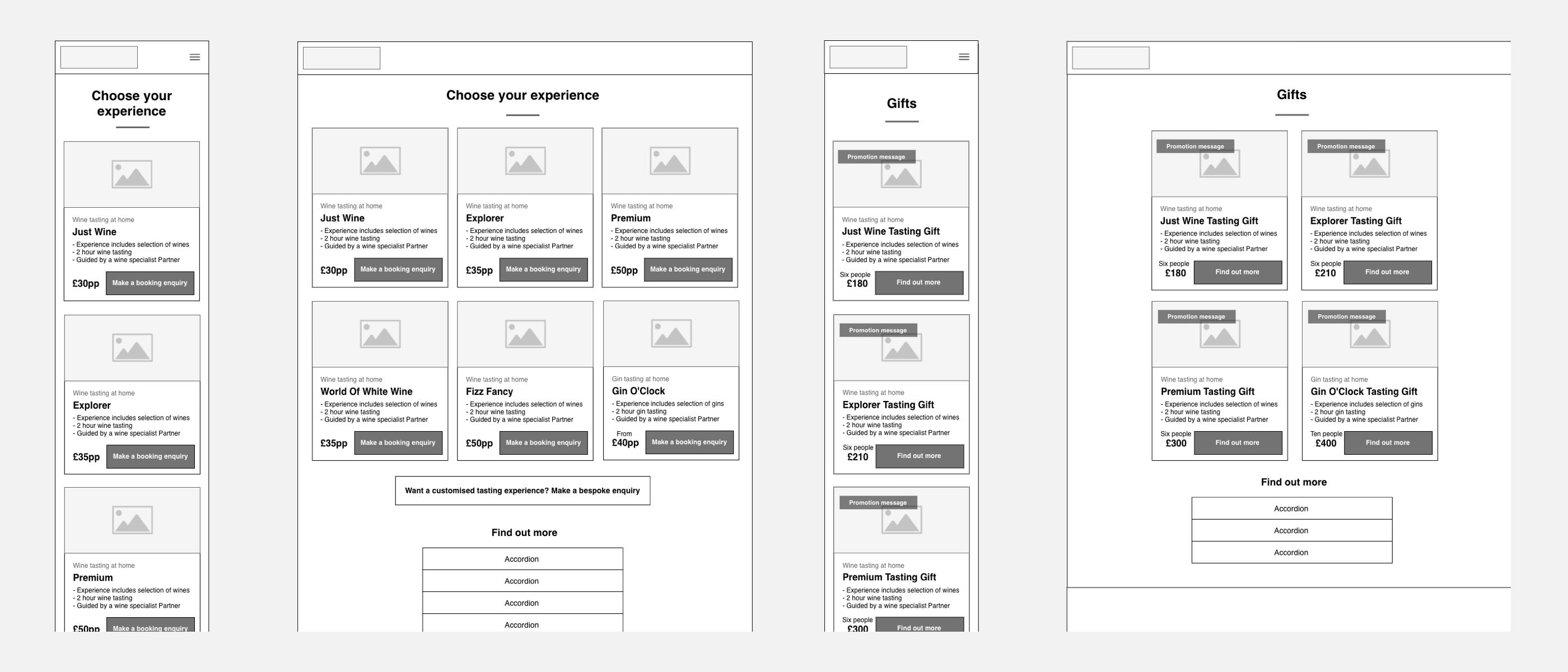
Low fidelity wireframing
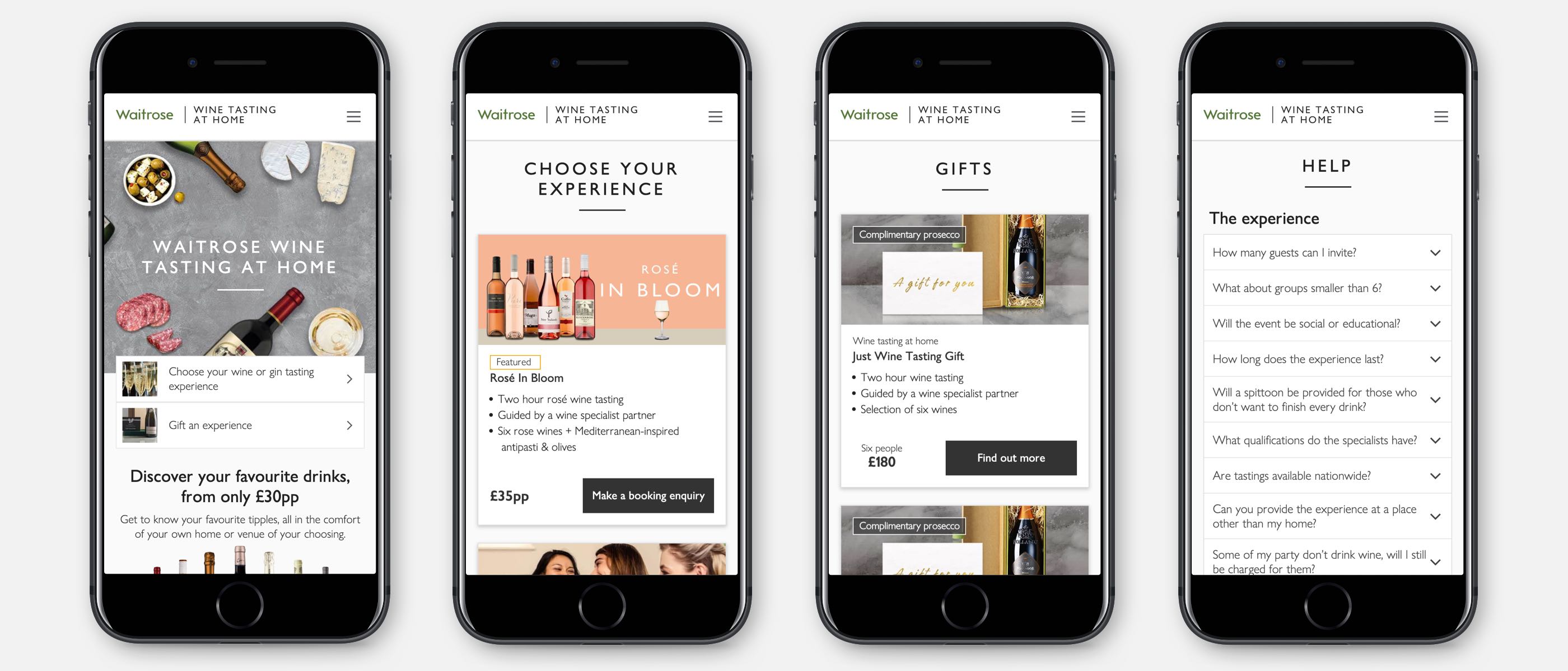
On the homepage, the content hierarchy was improved for users to infer the type of website they were visiting and their available options. Links to the categories - experiences and gifts were made prominent above the viewport fold. Previously these were hidden in an expanded navigation drawer.
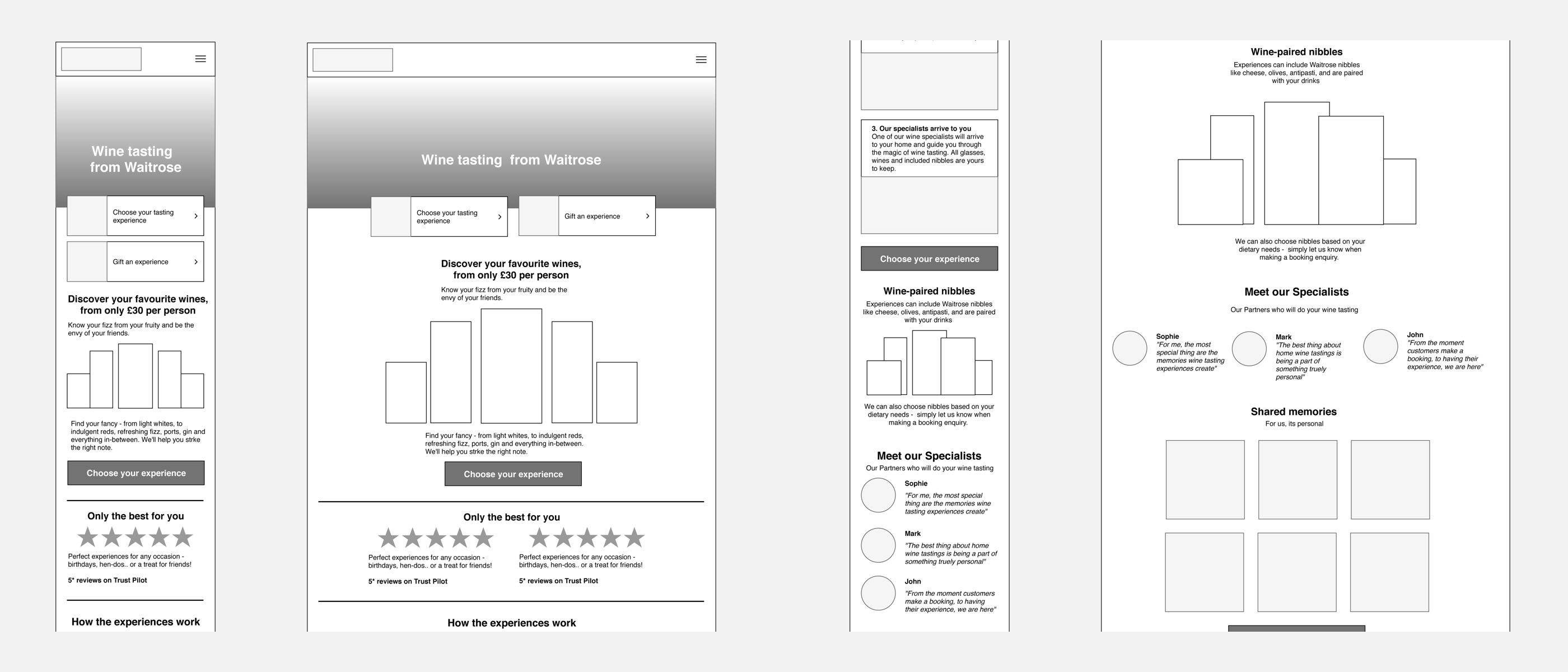
The tasting experience booking page was simplified to give users information they could easily scan, read and compare their options. By using reusable card components, future experiences could be added or removed. An accordion component on the page functioned as a snippet of faqs, to keep users on the page and informed.
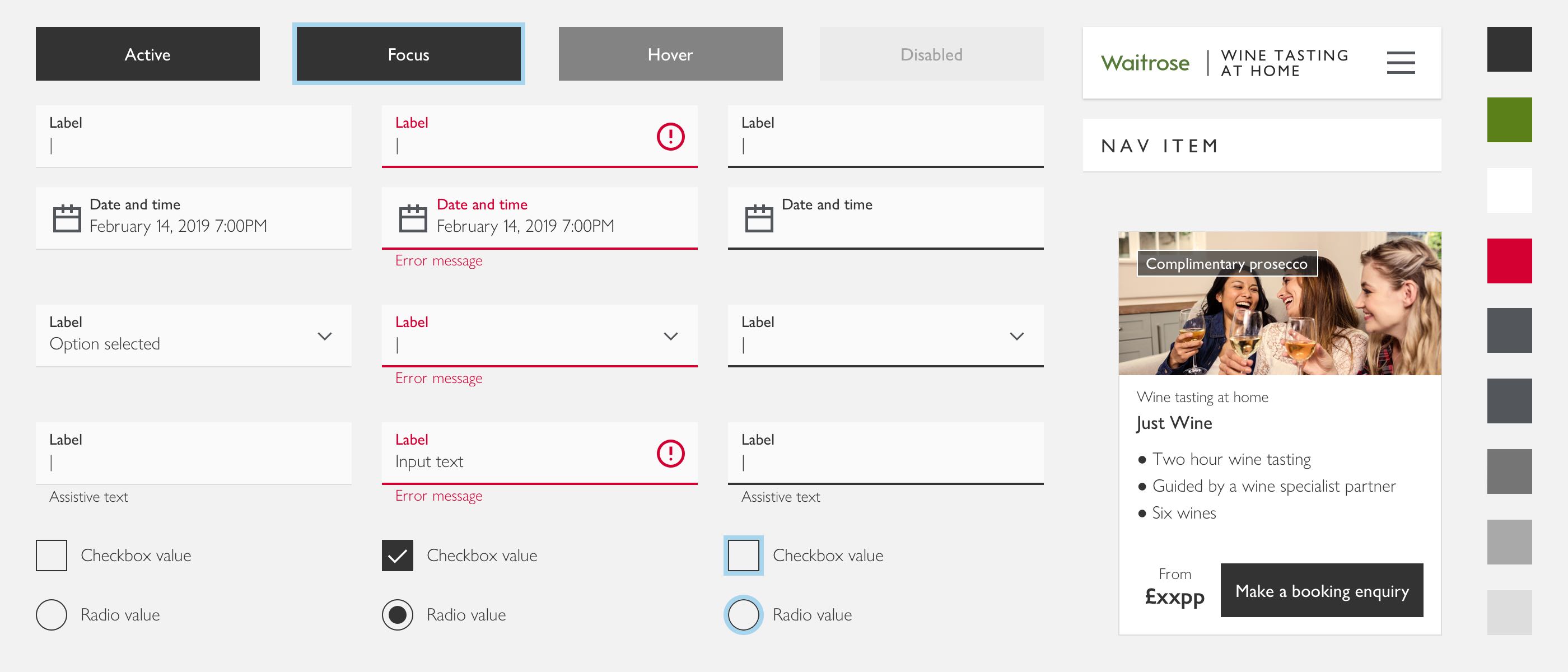
The form was simplified to remove duplicate input fields that added friction to the experience. For example, instead of 4 inputs, “Title” “First Name” “Middle name” and “Surname”, these were simply changed to 1 input “Full name”. Instead of using a modal overlay that had significant mobile scrolling usability issues, the form was embedded on the viewport.
Design system for consistency
To create interface consistency, and speed up development time, I worked on creating a design system. With reusable components, typography, colours and styles.
Outcome and performance
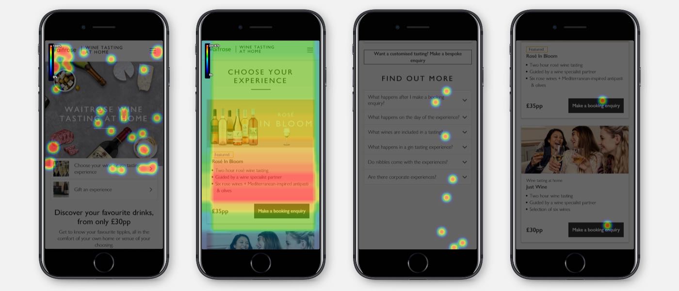
One month after pushing the new designs live, we repeated analytics and heat mapping. The results were positive and booking conversions had improved significantly on mobile. Through-traffic had improved from the homepage to the experience and gift page.
+29%
Increase in conversion on mobile devices
Success Submit, May 2019

+22%
Increase in conversion from Returning Users
Success Submit, May 2019